2021 Impact Report for Impact Alpha Strategy
| Real world equivalent | SDG relevance | ||
| Carbon efficiency |
1739.52 |
less tonnes of GHG (Scope 1 & 2) emissions | 7, 15 |
| Scope 3 efficiency | 1055.94 | less tonnes of Scope 3 emissions | 7, 15 |
| Waste efficiency |
727.78 |
less tonnes of waste generated | 6,12,14,15 |
| Water efficiency |
38.0 |
less thousand cubic metres fresh water used | 6 |
| Gender equality |
0.4% |
more women in top management | 5 |
| Executive pay |
-3.6 |
more multiples of average employee pay paid to top executives | 10 |
| Board independence |
-3.9% |
less board independence | 10,16 |
| Environmental good |
74.6% |
more invested in industries contributing to solving environmental issues | most SDGs |
| Social good |
1.7% |
more invested in industries helping alleviate social issues | most SDGs |
| Avoiding environmental harm |
55.4% |
less invested in industries aggravating environmental issues | most SDGs |
| Avoiding social harm |
0.5% |
less invested in industries aggravating social issues | most SDGs |
| Economic development |
$ 6,000 |
more economic activity in less developed economies | 1, 8, 9, 16, 17 |
| Avoiding water scarcity |
0.17 |
less water use in water scarce localities (World Resource Institute) | 16,17 |
| Employment |
0.7% |
more economic activity in high unemployment geographies | 1,8,11,12,16 |
| Tax gap |
0.95% |
more tax paid | 1,9, 10,16 |
In real terms compared to the Short Positions of Impact Alpha Strategy Benchmark, $1M invested in Long Positions of Impact Alpha Strategy finances:
Active Positions of Impact Alpha Strategy

Long Positions of Impact Alpha Strategy
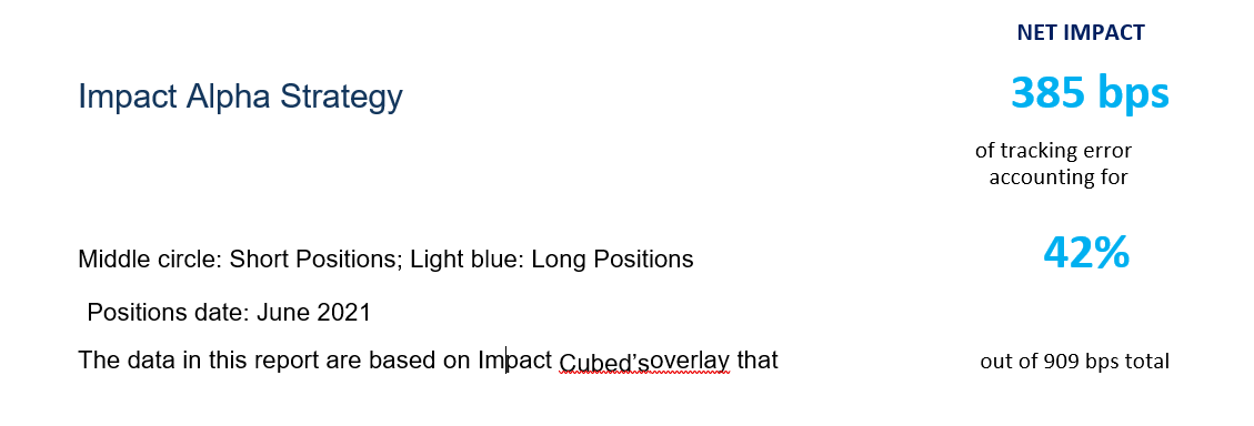
 IMPACT NUMBER
Our measure of total impact is the risk (measured in tracking error to short positions) of the active ESG shares needed to achieve the long positions’ impact exposure. The total number is a net of positive and negative impacts, so our measure can be negative if the portfolio has more negative exposures than positive (think ‘sin’ fund). The impact number will always fall between the total traditional tracking error figure and its negative. For example, if a portfolio has 100bps tracking error, its impact will fall between 100 and -100. The negative and positive impact numbers are shown separately for the set of factors above and below the short positions. Separating the positive and negative impact exposures can be useful, because sometimes strategies with the same net impact arrive at a similar number with very different underlying exposures. For example, Strategy 1 with Positive Impact = 41bps, and Negative Impact = 39bps, and Strategy 2 with Positive Impact = 6bps and Negative Impact = 4bps both arrive at the same net Total Impact of 2bps. But if you are concerned about avoiding negative sustainability impacts through your investments, you would seeStrategy 2 much more positively than Strategy.
RELATIVE PERFORMANCE
The relative performance measure takes into account the amount of net impact relative to the strategy’s overall TE. The higher this ratio relative to all strategies analysed to date by Impact Cubed, the higher the quartile in which the result will place. The blue marker shows approximately where the result falls within thequartile. The strategy universe is a diversified sample of ESG and mainstream strategies, covering all types of geographies, market caps and other characteristics, all analysed against their own benchmark. We update the universe periodically with new results. Because the sample is not peer matched to the particular strategy or otherwise rules-based, we advise to read the relativeperformancemeasureas a general indication only.
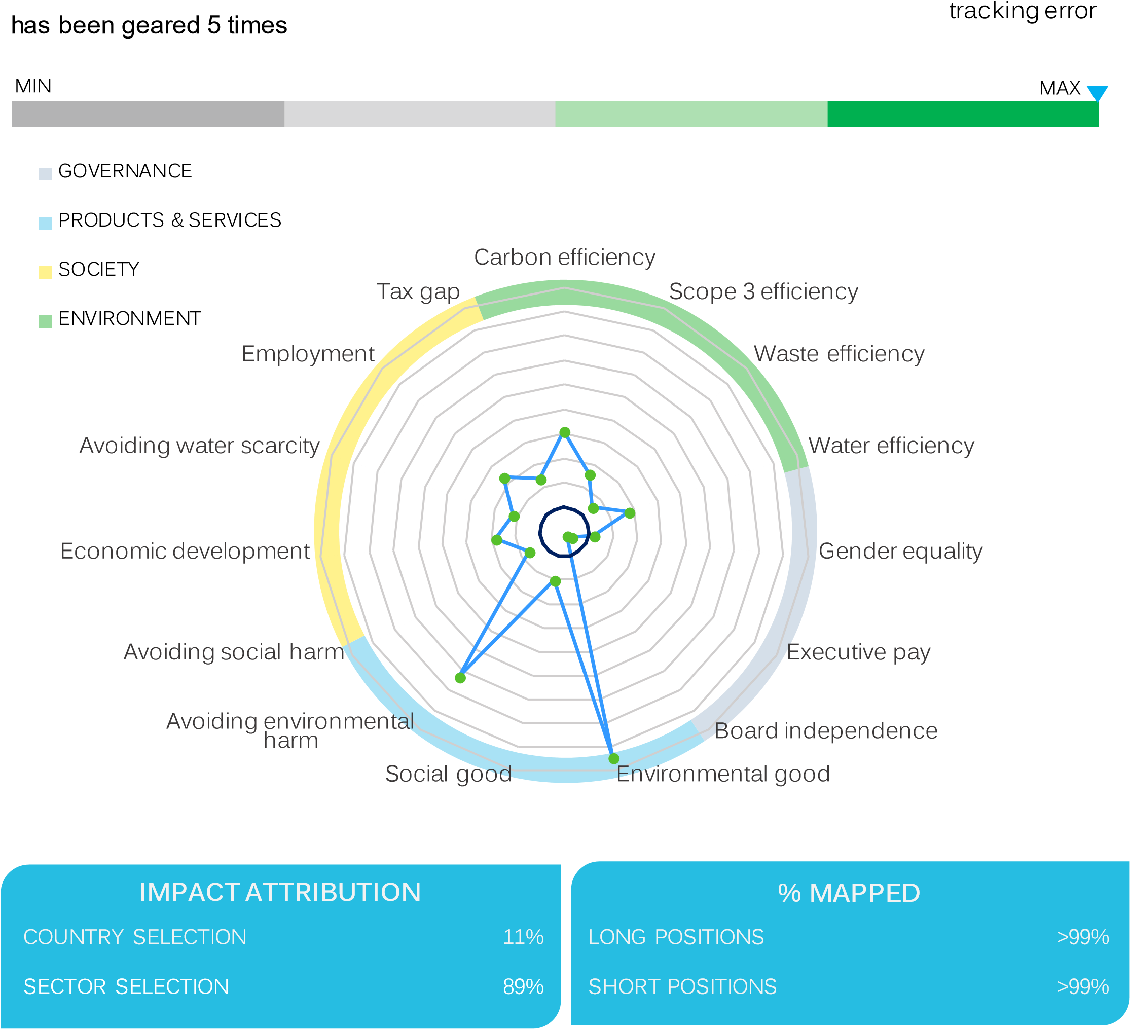
IMPACT GRAPH
How to read the impact graph
- The symmetrical navy circle in the middle of the graph represents theshortpositions.
- The (usually more irregular) bright blue line shows the long positions’ factor exposures relative to the short position values on each factor.
We use standard deviations of each indicator to unify the scale in the impact graph.If the two lines were exactly the same, this would mean the long positions are tracking the shortpositions closely on every impact factor.
When parts of the blue line which represent the long positions are outside the short positions circle, that indicates a positive impact. The further they are outside the short positions circle, the bigger the active exposure of the long positions to that particularimpact indicator.
When the blue line falls inside the short positions circle, this indicates that it has negative active exposure to an impact indicator. For example, in the example graph above, the sample strategy allocated more capital to companies with highly paid and maleexecutives.
All the indicators used in the model are positive indicators, meaning that the long positions line falling outside the short positions circle is always a positive. By looking at the graph, we can quickly tell how the positive and negative areas either side of the short positions circle compare to each other in terms of size (summarized in the single impact number), and also how the long positions’ impacts are distributed between the different indicators.
For example, if you were looking at a best in class governance quality strategy, you would want to see the blue line outside the short positions circle for Board independence, Executive pay and Gender equality, whereas someone looking for an environmentally focused strategy would want to see strong exposures in carbon, waste, water, and water scarcity, as well as the environmentalgoodand harmrevenues-based indicators.
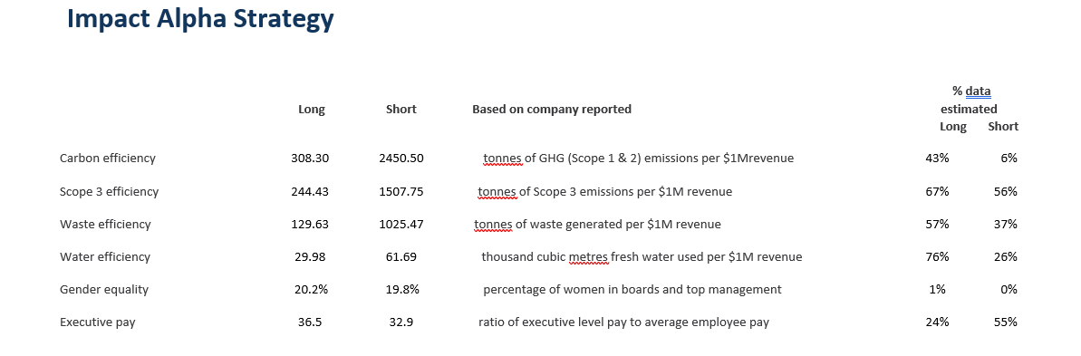
STRATEGY IMPACT MEASURES
This section reports the raw data in terms of long vs short positions, indicator by indicator. For example, for Executive pay we will show the weighted average of the ratio of top management pay over average employee pay for the long and short positions side by side. The standardized difference in these values is what is plotted on theimpact graph.
Estimated data
This is the percentage of positions by weight in the portfolio that did not report the data we use to calculate an indicator. We fill gaps in company reporting with proprietary estimation models and run quality checks on reported data to identify outliers. In rare instances, the numbers reported by companies are completely implausible and we actually replace them with estimations. We disclose the percentage of reported data for transparency, and because it is a simple and commonly recognized metric to understand how much of the data comes directly fromcompanies and howmuch relieson estimation.
INVESTMENT EQUIVALENTS
This table translates the long positions impact measures from the previous section into the impacts per unit of investment (for instance a euro, a pound or a dollar) compared to the short positions, and maps each of them to the UN Sustainable Development Goals. The values in green are positive impacts, and thosein red arenegative.
For example, in real terms, what is the difference between investing in a strategy with 8% tax gap vs. 12%? This section would translate this difference into 3 cents less tax paid by the listed companies held in the long positions per 1 dollar invested, compared to investing in the short positions.This number would show up in red because it’s a negative impact, and in the last column in the table you will see that this impact relates to Sustainable Development Goals1, 9, 10, and 16.
IMPACT ATTRIBUTION ANALYSIS
This part of the report shows the drivers of the portfolio’s impact both by indicator and at overall portfolio level. It is based on traditional financial performance attributionfor a portfolio.
Country and sector
We list what proportion of the impact in % is due to country vs. sector allocations.
This attribution helps further deepen the understanding of the impact profile of a portfolio and differentiate between similarly performing strategies. For example, a strategy performing well on Gender equality where 80% of this performance can be attributed to country selection is different than one with similar performance on this indicator driven 80% by sector selection.
The first would hint that most of the impact may be achieved simply by investing more in markets where gender balance in leadership is more even. The second would suggest that the same positive impact is more so the outcome of allocating to sectors which tend to have more women on boards and executive committees.
Top and bottom performers
Under Strategy Top and Bottom Performer we name the securities from the strategy holdings that have the highest and lowest factor exposures. For Tax gap, Gender equality, and business model based indicators, we report the number of positions which have no revenues from environmental and social good and harm, and those that have no diversity in top management or no taxgap.
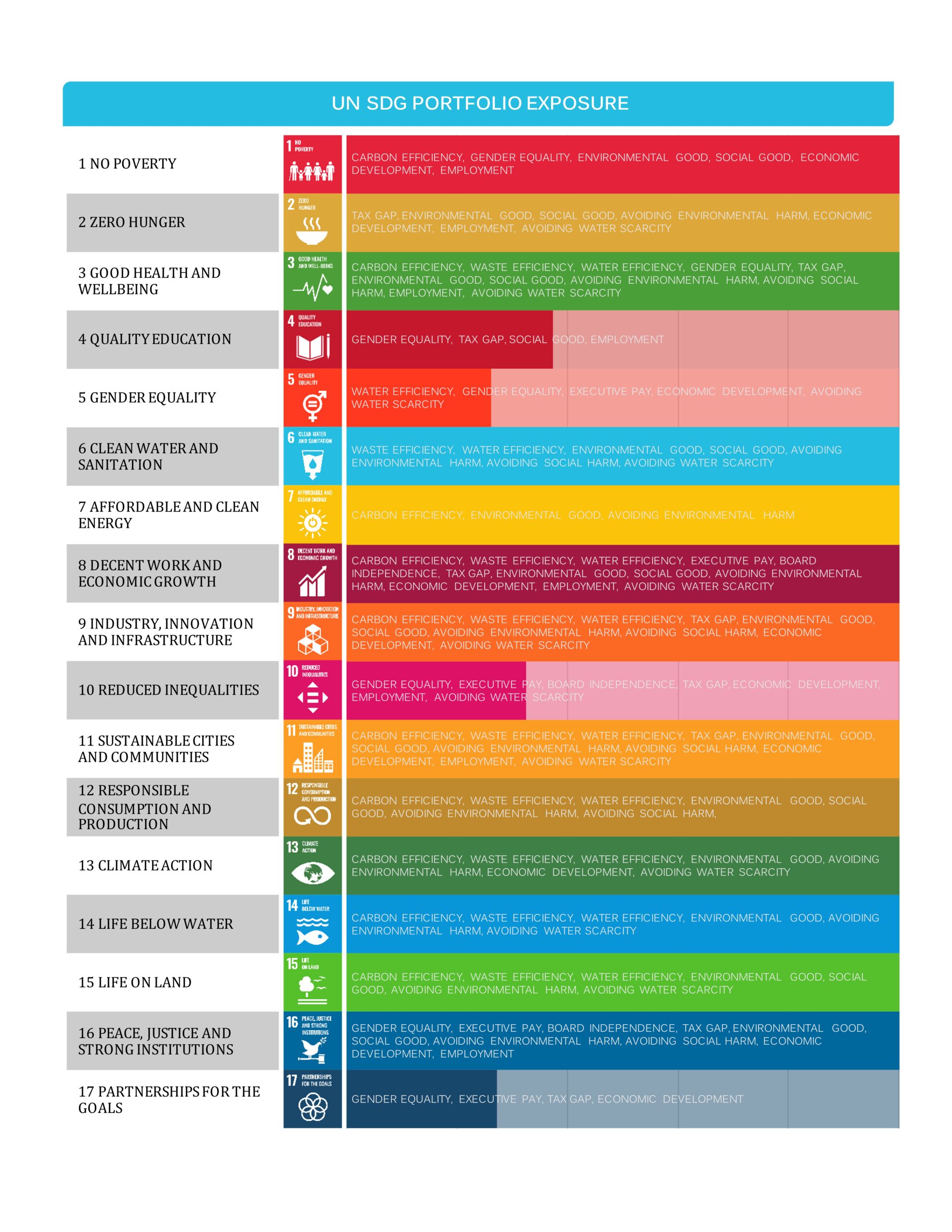
CONTRIBUTION BY SDG GOAL
This table shows to what degree the long positions analysed contributes to each of the 17 SDGs. The measure we use is a weighted average of all factor exposures (relative to the short positions) mapped to a particular SDG, adjusted for the number of these factors. The weighted average takes into account the direct or indirect relationship between factors and a specific goal.
ABOUT IMPACT-CUBED
Impact-Cubed measures Investment Impact in terms of sustainabledevelopment for anyportfolioof listed securities. Understanding, measuring and managing investment impact facilitates cheaper access to capital for more sustainable companies,and with that,encourages a flourishing planet. Impact-Cubed was originally used to measure investment impact in-house by Auriel Equity Investors LLP. It was spun off as a separate company (currently seeking B-Corp Certification in the UK) in summer 2017 with the intention of becoming a selfsustaining service to theinvestment community. It is our hope that this service helps investors make informed decisions about the way they allocate capital, by shedding light on the varying levels and areas of impact delivered by different investment strategies.